Understanding a company's financial health is impossible without visualizing its fundamentals over time. Is revenue accelerating? Are margins expanding? Is debt growing faster than equity? Fundamental charts answer these questions instantly by transforming financial statements into visual insights.
Stock Alarm Pro's Fundamental Charts feature provides interactive visualizations for 50+ financial metrics—from revenue and earnings to cash flow, margins, ratios, and growth rates. Compare up to 8 stocks simultaneously, toggle between annual and quarterly data, and overlay dual metrics to spot trends that spreadsheets miss.
In this comprehensive guide, you'll learn how to use fundamental charts for stock analysis, which metrics matter most, and how to spot red flags and opportunities in financial data.
What are Fundamental Charts?
Fundamental charts are visual representations of a company's financial data extracted from:
- Income statements (revenue, profits, expenses)
- Balance sheets (assets, liabilities, equity)
- Cash flow statements (operating, investing, financing)
- Key financial ratios (valuation, profitability, leverage)
- Growth metrics (YoY revenue, earnings, cash flow growth)
Unlike price charts that show market sentiment, fundamental charts reveal business performance—the actual financial health and trajectory of a company.
Why fundamental charts matter:
- Spot trends instantly: See if revenue is accelerating or decelerating
- Identify inflection points: Catch margin expansion or contraction early
- Compare companies: Evaluate peers side-by-side on key metrics
- Make informed decisions: Base investments on business fundamentals, not just price action
Access fundamental charts: Any stock page → Click a metric (e.g., Apple Revenue Chart)
50+ Fundamental Metrics You Can Chart
Stock Alarm Pro provides comprehensive charting across 6 major categories:
1. Growth Metrics (6 charts)
Track year-over-year growth rates to identify accelerating or decelerating businesses:
| Metric | What It Measures | Why It Matters |
|---|---|---|
| Revenue Growth | YoY sales growth % | Top-line expansion, market share gains |
| Net Income Growth | YoY profit growth % | Bottom-line efficiency, profitability improvement |
| EPS Growth | YoY earnings per share growth % | Shareholder value creation |
| Operating Income Growth | YoY operating profit growth % | Core business profitability |
| Gross Profit Growth | YoY gross profit growth % | Pricing power, unit economics |
| R&D Expense Growth | YoY R&D spending growth % | Innovation investment (higher ≠ better) |
Use cases:
- Growth investing: Find companies with 20%+ revenue growth
- Quality screening: Identify earnings growing faster than revenue (margin expansion)
- Red flags: Spot negative growth or decelerating trends
Example: Apple Revenue Growth Chart
2. Valuation Ratios (4 charts)
Determine if a stock is expensive or cheap relative to fundamentals:
| Metric | What It Measures | What's "Good"? |
|---|---|---|
| P/E Ratio | Price ÷ Earnings per Share | Lower = cheaper (but context matters) |
| Price to Sales | Market Cap ÷ Revenue | < 3 for mature, < 10 for growth |
| Price to Book | Price ÷ Book Value per Share | < 3 for value stocks |
| EV to Sales | Enterprise Value ÷ Revenue | Similar to P/S, but accounts for debt |
Use cases:
- Value investing: Find low P/E, P/B stocks trading below intrinsic value
- Valuation compression: Spot expanding P/E ratios (market paying more per $ of earnings)
- Peer comparison: Compare valuations across sector (e.g., is Tesla's P/E justified vs. Ford?)
Example: Apple P/E Ratio Chart
3. Profitability Metrics (6 charts)
Measure how efficiently a company converts revenue into profit:
| Metric | What It Measures | What's "Good"? |
|---|---|---|
| ROE (Return on Equity) | Net Income ÷ Shareholder Equity | > 15% is strong, > 20% is excellent |
| ROIC (Return on Invested Capital) | Operating Profit ÷ Invested Capital | > 15% indicates competitive advantage |
| Return on Tangible Assets | Earnings ÷ Tangible Assets | Higher = better asset utilization |
| Income Quality | Operating Cash Flow ÷ Net Income | > 1.0 means quality earnings (cash-backed) |
| Earnings Yield | EPS ÷ Price (inverse of P/E) | Higher = cheaper |
| Free Cash Flow Yield | FCF per Share ÷ Price | > 5% is attractive |
Use cases:
- Quality compounders: Find ROE > 20% and ROIC > 15% (durable moats)
- Capital efficiency: Compare ROIC to cost of capital (WACC)
- Earnings quality: Verify net income is backed by cash (Income Quality > 1.0)
Example: Apple ROE Chart
4. Financial Health Ratios (5 charts)
Assess a company's ability to handle debt and weather downturns:
| Metric | What It Measures | What's "Good"? |
|---|---|---|
| Debt to Equity | Total Debt ÷ Shareholder Equity | < 1.0 is conservative, < 0.5 is very safe |
| Debt to Assets | Total Debt ÷ Total Assets | < 0.4 is low leverage |
| Current Ratio | Current Assets ÷ Current Liabilities | > 1.5 is healthy liquidity |
| Interest Coverage | EBIT ÷ Interest Expense | > 5x is safe, < 2x is risky |
| Payout Ratio | Dividends ÷ Net Income | < 60% is sustainable for dividends |
| Dividend Yield | Annual Dividend ÷ Price | Higher = more income (but check sustainability) |
Use cases:
- Risk assessment: Avoid overleveraged companies (D/E > 2.0)
- Dividend safety: Confirm payout ratio < 60% and interest coverage > 5x
- Turnaround plays: Find improving debt ratios in cyclical recovery
Example: Apple Debt to Equity Chart
5. Income Statement Metrics (7 charts)
Analyze revenue, costs, and profitability from the income statement:
| Metric | What It Measures | Why Chart It? |
|---|---|---|
| Revenue | Total sales from goods/services | Top-line growth trend |
| Cost of Revenue | Direct costs (COGS) | Gross margin trajectory |
| Gross Profit | Revenue - COGS | Unit economics, pricing power |
| Operating Expenses | SG&A, R&D, overhead | Operating leverage, expense control |
| Operating Income | Core business profit (before interest/taxes) | True operational performance |
| Net Income | Bottom-line profit | Shareholder earnings |
| EBITDA | Earnings before interest, taxes, D&A | Cash-proxy, capital intensity |
Use cases:
- Margin analysis: Chart Gross Profit ÷ Revenue to see if margins are expanding
- Operating leverage: Spot revenue growing faster than operating expenses
- Profitability inflection: Identify companies turning profitable (Net Income > 0)
Example: Apple Revenue Chart
6. Balance Sheet Metrics (6 charts)
Understand a company's assets, liabilities, and equity:
| Metric | What It Measures | Why Chart It? |
|---|---|---|
| Total Assets | Everything the company owns | Asset growth trajectory |
| Total Liabilities | Everything the company owes | Liability accumulation |
| Stockholders Equity | Net worth (Assets - Liabilities) | Book value growth |
| Cash & Equivalents | Liquid cash on hand | Financial cushion, M&A capacity |
| Total Debt | Short-term + long-term debt | Leverage trajectory |
| Net Debt | Total Debt - Cash | True debt burden |
Use cases:
- Balance sheet strength: Track cash accumulation vs. debt growth
- Acquisitions: Identify companies building cash for buyouts
- Financial distress: Spot shrinking equity or surging liabilities
Example: Apple Total Assets Chart
7. Cash Flow Statement Metrics (6 charts)
Analyze cash generation and capital allocation:
| Metric | What It Measures | Why Chart It? |
|---|---|---|
| Operating Cash Flow | Cash from core business | Real profitability (better than net income) |
| Investing Cash Flow | Cash spent on investments/assets | CapEx intensity, acquisitions |
| Financing Cash Flow | Cash from debt/equity issuance | Buybacks, dividends, debt paydowns |
| Free Cash Flow | Operating CF - CapEx | Cash available for growth, dividends, buybacks |
| Capital Expenditure | Cash spent on PP&E | CapEx intensity, maintenance needs |
| Dividends Paid | Cash distributed to shareholders | Dividend consistency |
Use cases:
- Cash generation: Prioritize companies with growing Operating Cash Flow
- Capital intensity: Avoid businesses with CapEx > 50% of Operating Cash Flow
- Shareholder returns: Track Free Cash Flow → Dividends + Buybacks
Example: Apple Free Cash Flow Chart
Key Features of Stock Alarm Pro's Fundamental Charts
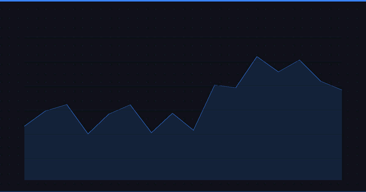
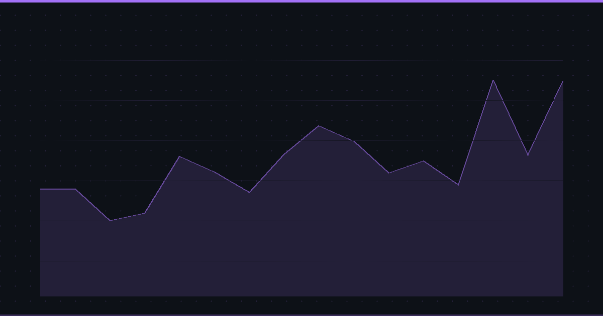
1. Interactive Time Series Charts
Every metric is visualized as a time series line chart showing trends over:
- Annual data: Up to 15 years of fiscal year data
- Quarterly data: Up to 10 years of quarterly filings (40 quarters)
Toggle between annual and quarterly:
- Annual = Long-term trends, smoothed seasonality
- Quarterly = Recent momentum, detect inflection points
2. Multi-Symbol Comparison (Up to 8 Stocks)
Compare fundamentals across competitors, peers, or portfolio holdings:
Single metric mode: Compare up to 8 stocks on one metric
- Example: Compare revenue of AAPL, MSFT, GOOGL, AMZN, META, TSLA, NVDA, NFLX
Dual metric mode: Compare up to 2 stocks on two metrics
- Example: Compare AAPL vs. MSFT with Revenue (Metric 1) and Net Income (Metric 2) overlaid
Each symbol gets a unique color for easy differentiation:
- Blue (primary), Amber, Green, Purple, Red, Cyan, Orange, Pink
3. Dual Metric Overlay
Overlay two metrics on the same chart to identify correlations or divergences:
Powerful combinations:
- Revenue vs. Net Income: Spot margin expansion/contraction
- Operating Cash Flow vs. Net Income: Verify earnings quality
- Total Assets vs. Total Debt: Track leverage over time
- Revenue Growth vs. EPS Growth: Identify operating leverage
- Gross Profit vs. Operating Expenses: Analyze margin structure
Use cases:
- Margin analysis: If Revenue grows but Net Income shrinks → margin compression
- Earnings quality: If Net Income > Operating Cash Flow → low-quality earnings
- Capital efficiency: If Assets grow faster than Revenue → declining asset turnover
4. Automatic Scaling & Formatting
Charts automatically format values for readability:
- Currency: $383.93B (billions), $1.2M (millions)
- Percentages: 15.3% (growth, margins, ratios)
- Ratios: 2.45x (debt ratios, coverage ratios)
- Decimals: 1.23 (quality metrics)
5. Detailed Metric Descriptions
Every chart includes:
- Metric name (e.g., "Return on Equity")
- Description (what it measures and why it matters)
- Good when higher? indicator (helps interpret trends)
How to Use Fundamental Charts: Step-by-Step Workflows
Workflow 1: Analyzing a Single Stock (Deep Dive)
Goal: Understand Apple's financial health and trajectory.
Step 1: Start with Revenue
- Go to Apple's quote page
- Click "Revenue" metric
- Toggle between Annual and Quarterly views
- What to look for: Is revenue growing? Accelerating? Decelerating?
Step 2: Check Profitability
- Click "Net Income" metric
- Compare Net Income growth to Revenue growth
- Red flag: If Revenue grows but Net Income shrinks → margin compression
- Good sign: Net Income growing faster than Revenue → margin expansion
Step 3: Analyze Margins
- Overlay "Revenue" (Metric 1) with "Net Income" (Metric 2)
- Calculate Net Margin = Net Income ÷ Revenue
- What to look for: Expanding margins = improving efficiency
Step 4: Verify Earnings Quality
- Chart "Operating Cash Flow"
- Compare to "Net Income"
- Red flag: If OCF < Net Income → earnings may be inflated by accounting
- Good sign: OCF > Net Income → high-quality, cash-backed earnings
Step 5: Assess Financial Health
- Check "Debt to Equity" ratio
- Chart "Net Debt" trend
- Red flag: Rising debt without corresponding revenue growth
- Good sign: Declining debt or stable leverage with growing earnings
Step 6: Calculate Shareholder Returns
- Chart "Free Cash Flow"
- Compare to "Dividends Paid" + "Share Buybacks"
- What to look for: FCF > Dividends + Buybacks = sustainable returns
Workflow 2: Comparing Competitors (Peer Analysis)
Goal: Compare Apple vs. Microsoft vs. Google on key metrics.
Step 1: Choose a Key Metric
- Start with "Revenue" or "Net Income"
- Add compare symbols:
MSFT, GOOGL
Step 2: Compare Growth Rates
- Switch to "Revenue Growth" metric
- Question: Who's growing faster? Is anyone decelerating?
Step 3: Compare Profitability
- Chart "ROE" for all three
- Winner: Highest and most consistent ROE
Step 4: Compare Valuation
- Chart "P/E Ratio" for all three
- Question: Who's cheapest relative to earnings?
Step 5: Compare Financial Health
- Chart "Debt to Equity" for all three
- Question: Who has the cleanest balance sheet?
Key takeaway: Use multi-symbol comparison to identify the best-in-class within a sector.
Workflow 3: Finding Value Stocks (Contrarian Investing)
Goal: Find undervalued stocks with improving fundamentals.
Step 1: Screen for Low Valuations
- Use the S&P 500 Screener
- Filter:
pe < 15 AND priceToBook < 2
Step 2: Chart Revenue Growth
- For each candidate, chart "Revenue Growth"
- Requirement: Recent quarters showing positive growth (turnaround signal)
Step 3: Check Margins
- Chart "Net Margin" or overlay "Net Income" with "Revenue"
- Requirement: Margins stable or expanding (not deteriorating)
Step 4: Verify Balance Sheet
- Chart "Current Ratio" (liquidity)
- Chart "Debt to Equity" (leverage)
- Requirement: Current Ratio > 1.5, D/E < 1.0
Step 5: Confirm Earnings Quality
- Chart "Income Quality" ratio
- Requirement: > 1.0 (cash-backed earnings)
Result: Undervalued stocks with improving fundamentals = value opportunities.
Workflow 4: Identifying Growth Stocks (Momentum Investing)
Goal: Find high-growth companies with sustainable profitability.
Step 1: Screen for High Growth
- Use the S&P 500 Screener
- Filter:
revenueGrowth > 20 AND netIncomeGrowth > 15
Step 2: Chart Revenue Trajectory
- Chart "Revenue" (annual)
- Question: Is growth accelerating (hockey stick) or linear?
Step 3: Check Profitability
- Chart "Net Margin"
- Requirement: Positive and expanding margins
Step 4: Assess Scalability
- Overlay "Revenue" with "Operating Expenses"
- Good sign: Revenue growing faster than OpEx = operating leverage
Step 5: Verify Cash Generation
- Chart "Free Cash Flow"
- Requirement: Positive FCF or improving FCF margin
Result: High-growth stocks with strong unit economics = growth opportunities.
Workflow 5: Detecting Red Flags (Risk Analysis)
Goal: Identify warning signs before a stock crashes.
Red Flag 1: Revenue Growth Decelerating
- Chart "Revenue Growth" (quarterly)
- Warning: 3+ consecutive quarters of declining growth
Red Flag 2: Margins Compressing
- Overlay "Revenue" with "Net Income"
- Warning: Revenue grows but Net Income flat/declining
Red Flag 3: Deteriorating Earnings Quality
- Chart "Income Quality" ratio
- Warning: Falling below 1.0 (earnings not backed by cash)
Red Flag 4: Rising Leverage
- Chart "Debt to Equity"
- Warning: Rapidly increasing debt without corresponding revenue growth
Red Flag 5: Unsustainable Dividends
- Chart "Payout Ratio"
- Warning: > 80% (little room for dividend cuts if earnings decline)
Red Flag 6: Negative Free Cash Flow
- Chart "Free Cash Flow"
- Warning: Multiple quarters of negative FCF (cash burn)
Action: If you spot 2+ red flags, reduce position or exit.
Common Questions About Fundamental Charts
What's the difference between fundamental charts and price charts?
| Feature | Price Charts | Fundamental Charts |
|---|---|---|
| What they show | Market sentiment (buy/sell pressure) | Business performance (financials) |
| Frequency | Real-time, minute-by-minute | Quarterly or annual (earnings reports) |
| Use case | Technical analysis, trading | Valuation, long-term investing |
| Key metrics | Price, volume, moving averages | Revenue, earnings, cash flow, ratios |
| Best for | Timing entry/exit | Assessing intrinsic value |
Bottom line: Price charts tell you what investors think a stock is worth. Fundamental charts tell you what the business is actually worth.
How often are fundamental charts updated?
Fundamental data updates when companies file quarterly or annual reports:
- Quarterly reports (10-Q): Filed 45 days after quarter ends
- Annual reports (10-K): Filed 90 days after fiscal year ends
Stock Alarm Pro updates fundamental data daily, pulling the latest filings from SEC EDGAR.
Can I export fundamental chart data?
Yes, Pro users can export any chart data to CSV for analysis in Excel, Python, or other tools.
Why are some metrics missing for certain stocks?
Not all companies report every metric:
- Startups/unprofitable: May not have positive Net Income or dividends
- Non-financial companies: May not report certain banking-specific ratios
- Different accounting: Some metrics use GAAP vs. non-GAAP calculations
If a metric is unavailable, it won't appear in the chart list.
What's better: Annual or Quarterly data?
| Use Annual Data When... | Use Quarterly Data When... |
|---|---|
| Analyzing long-term trends (10+ years) | Spotting recent inflection points |
| Comparing across industries (removes seasonality) | Detecting momentum shifts |
| Valuing mature, stable companies | Analyzing growth stocks with rapid change |
| Smoothing out quarterly volatility | Checking for quarterly consistency |
Pro tip: Start with Annual for the big picture, then zoom into Quarterly for recent trends.
How do I compare stocks across different industries?
Some metrics are universal (ROE, Revenue Growth), but others vary by industry:
- Capital intensity: Utilities have high CapEx, software has low CapEx
- Margins: Software (70%+ gross margin) vs. retail (20% gross margin)
- Leverage: REITs have high D/E (normal), tech has low D/E
Best practice: Use percentile rankings within sector, not absolute values.
Fundamental Charts vs. Competitors
How Stock Alarm Pro compares to YCharts, TradingView, Stock Rover, and Zacks:
| Feature | Stock Alarm Pro | YCharts | Stock Rover | TradingView | Zacks |
|---|---|---|---|---|---|
| Metrics available | 50+ | 100+ | 50+ | Limited | 30+ |
| Multi-stock comparison | ✅ Up to 8 symbols | ✅ Up to 10 | ✅ Up to 10 | ❌ Limited | ⚠️ 2-3 stocks |
| Dual metric overlay | ✅ Yes | ✅ Yes | ⚠️ Limited | ❌ No | ❌ No |
| Annual + Quarterly toggle | ✅ Yes | ✅ Yes | ✅ Yes | ⚠️ Limited | ✅ Yes |
| Interactive charts | ✅ Yes | ✅ Yes | ✅ Yes | ✅ Yes | ⚠️ Basic |
| Export to CSV | ✅ Pro users | ✅ Paid | ✅ Paid | ⚠️ Limited | ✅ Paid |
| Mobile experience | ✅ Fully responsive | ⚠️ Limited | ⚠️ Limited | ✅ Good | ⚠️ Poor |
| Integrated with screener | ✅ Yes | ❌ No | ✅ Yes | ❌ No | ⚠️ Limited |
| Real-time price alerts | ✅ Yes | ❌ No | ❌ No | ✅ Yes | ❌ No |
| Cost | $24/mo or $240/yr | $200-500/yr | $180-300/yr | Free (basic) | $249/yr |
Unique advantages of Stock Alarm Pro:
- Integrated ecosystem: Screener → Charts → Alerts in one platform
- Mobile-first design: Full functionality on phones and tablets
- Faster performance: Client-side rendering, instant interactions
- Alert integration: Set price/fundamental alerts directly from charts
Advanced Tips for Power Users
Tip 1: Combine Fundamental + Technical Analysis
Use fundamental charts to find quality stocks, then use price charts to time entry:
Example workflow:
- Use fundamental charts to find ROE > 20%, Revenue Growth > 15%
- Switch to price chart and wait for RSI < 40 (oversold)
- Enter when fundamentals are strong but price is temporarily weak
Tip 2: Track Margin Trends for Early Signals
Overlay "Revenue" with "Operating Income" to track operating margin:
- Expanding margin: Operating Income growing faster than Revenue (good)
- Compressing margin: Operating Income growing slower than Revenue (bad)
Early warning: Margin compression often precedes earnings misses.
Tip 3: Use Quarterly Data to Spot Inflection Points
Annual data smooths out volatility, but quarterly data catches momentum shifts:
- Example: Revenue growth accelerating from 5% → 10% → 15% over 3 quarters = inflection
- Trade: Buy before the market fully prices in the acceleration
Tip 4: Compare Capital Efficiency (ROIC vs. Revenue Growth)
Chart "ROIC" for multiple stocks and sort by highest:
- High ROIC + High Growth: Best investments (compounding machines)
- High ROIC + Low Growth: Mature, cash cows (dividend payers)
- Low ROIC + High Growth: Capital-intensive growth (risky)
- Low ROIC + Low Growth: Avoid (no competitive advantage)
Tip 5: Build Custom Scoring Models
Export fundamental chart data and build custom scores:
- Quality Score: (ROE × 0.3) + (ROIC × 0.3) + (Debt/Equity × -0.2) + (FCF Yield × 0.2)
- Growth Score: (Revenue Growth × 0.4) + (EPS Growth × 0.4) + (Net Margin × 0.2)
- Value Score: (1/PE × 0.4) + (1/PS × 0.3) + (Dividend Yield × 0.3)
Combine scores to create a holistic ranking system.
Conclusion: Start Charting Fundamentals Today
Fundamental charts transform raw financial statements into visual insights that reveal: ✅ Revenue and earnings growth trajectories ✅ Profitability trends and margin expansion ✅ Financial health and leverage risks ✅ Cash generation and capital allocation ✅ Valuation compression or expansion
Stock Alarm Pro's Fundamental Charts give you:
- 50+ metrics across growth, profitability, valuation, and financial health
- Multi-symbol comparison (up to 8 stocks on one metric)
- Dual metric overlay to spot correlations and divergences
- Annual + Quarterly toggle for long-term trends and recent momentum
- Interactive, mobile-friendly charts with automatic formatting
Get started now: Pick any stock → View fundamental charts
New to Stock Alarm Pro? Start your free 7-day trial to unlock all 50+ fundamental charts, multi-stock comparison, and export capabilities.
Related Articles
- S&P 500 Stock Screener: Complete Guide (available now)
- How to Read Financial Statements (coming soon)
- Valuation Analysis: P/E vs. P/S vs. P/B (coming soon)
- Cash Flow Analysis for Investors (coming soon)
Have questions about fundamental charts? Contact our support team or join our Discord community for live help.