A stock chart looks like chaos the first time you see it.
Lines going everywhere. Red and green bars. Numbers and abbreviations. It feels like you need a finance degree just to understand what you're looking at.
You don't.
Stock charts are simply visual stories of price over time. Once you know what to look for, they become remarkably readable—and incredibly useful.
This guide will teach you to read stock charts from scratch. No jargon without explanation. No assumptions about what you already know. By the end, you'll look at any chart and understand what it's telling you.
What Is a Stock Chart?
A stock chart is a visual representation of a stock's price history.
The horizontal axis (x-axis) shows time—days, weeks, months, or even minutes. The vertical axis (y-axis) shows price.
That's it. Everything else is built on this foundation.
Why charts matter:
Charts reveal what thousands of buyers and sellers collectively decided a stock was worth at any moment. They show:
- Where price has been
- How it got there
- Patterns that might suggest where it's going
You don't need to predict the future. You just need to read the story price is telling.
Types of Stock Charts
1. Line Charts
What it shows: A simple line connecting closing prices over time.
Looks like: A single squiggly line moving across the chart.
Pros:
- Cleanest, easiest to read
- Great for seeing overall trend
- Less visual noise
Cons:
- Only shows closing price (misses intraday action)
- No information about opens, highs, or lows
- Can hide important price action
Best for: Getting a quick sense of direction, long-term trend analysis.
2. Bar Charts (OHLC)
What it shows: Four data points for each time period—Open, High, Low, Close.
Looks like: Vertical lines with small horizontal ticks on each side.
How to read it:
- Vertical line = range from low to high
- Left tick = opening price
- Right tick = closing price
Pros:
- Shows full price range
- More information than line charts
- Popular with traditional technical analysts
Cons:
- Can look cluttered
- Takes practice to read quickly
Best for: Traders who want full price data without candlestick patterns.
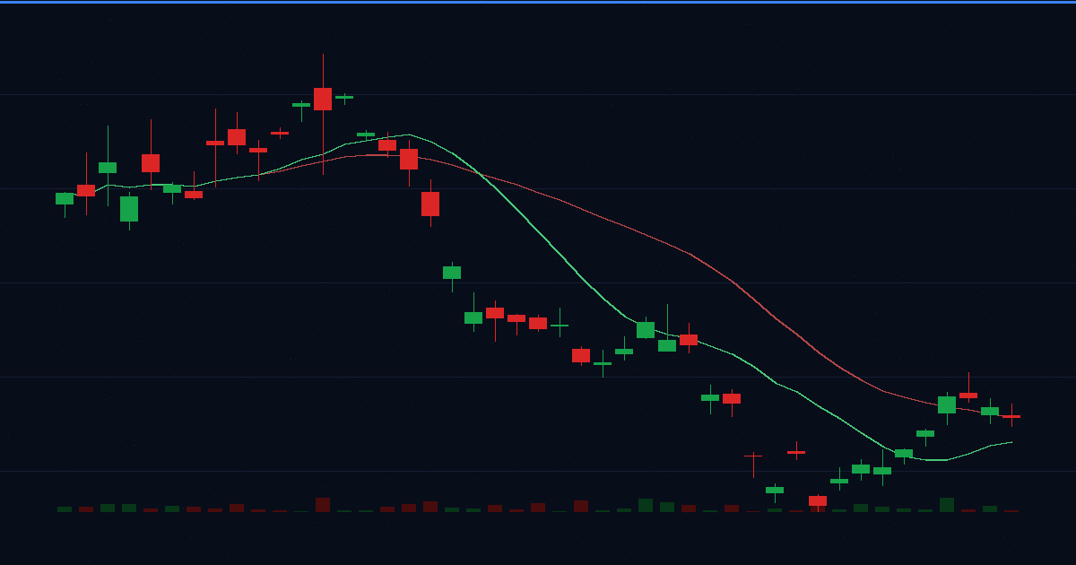
3. Candlestick Charts
What it shows: Same four data points (OHLC) as bar charts, but in a more visual format.
Looks like: Rectangles ("bodies") with lines ("wicks") extending above and below.
This is the chart type you should learn. It's the most popular and most informative.
Let's break it down completely.
How to Read Candlesticks
Each candlestick represents one time period (one day on a daily chart, one hour on an hourly chart, etc.).
Anatomy of a Candlestick
code-highlight│ ← Upper Wick (Shadow) │ High of the period ┌───┴───┐ │ │ ← Body │ │ Shows open-to-close range └───┬───┘ │ ← Lower Wick (Shadow) │ Low of the period
The Four Prices
- Open: Where price started when the period began
- High: The highest price reached during the period
- Low: The lowest price reached during the period
- Close: Where price ended when the period closed
Reading the Color
Green (or white) candle:
- Close is HIGHER than open
- Buyers won this period
- Bullish candle
Red (or black) candle:
- Close is LOWER than open
- Sellers won this period
- Bearish candle
Reading the Body Size
Long body:
- Strong move from open to close
- Decisive victory for buyers (green) or sellers (red)
- Indicates conviction
Short body:
- Small move from open to close
- Neither buyers nor sellers dominated
- Indicates indecision
Reading the Wicks
Long upper wick:
- Price went up during the period but got pushed back down
- Sellers showed up at higher prices
- Potential resistance
Long lower wick:
- Price went down during the period but got pushed back up
- Buyers showed up at lower prices
- Potential support
No wicks:
- Price moved in one direction all period
- Very strong conviction (bullish or bearish)
Important Candlestick Patterns
You don't need to memorize dozens of patterns. Start with these essential ones:
Bullish Patterns (Suggest Upward Move)
Hammer
code-highlight│ ┌───┴───┐ │ ▇▇▇ │ Small body at top └───┬───┘ │ │ Long lower wick │
- Small body at top of range
- Long lower wick (2x+ body length)
- Shows buyers rejected lower prices
- Most meaningful after a downtrend
Bullish Engulfing
code-highlightDay 1:  ┌─┐     Day 2:  ┌─────┐
        │▓│             │     │
        └─┘             │     │
                        └─────┘
        Red             Green (larger)
- Green candle completely "engulfs" previous red candle
- Buyers overwhelmed sellers
- Potential reversal signal
Morning Star
- Three candles: big red → small body (any color) → big green
- Shows selling exhaustion, then indecision, then buying
- Potential bottom reversal
Bearish Patterns (Suggest Downward Move)
Shooting Star
code-highlight│ │ Long upper wick │ ┌───┴───┐ │ ▇▇▇ │ Small body at bottom └───┬───┘ │
- Small body at bottom of range
- Long upper wick
- Shows sellers rejected higher prices
- Most meaningful after an uptrend
Bearish Engulfing
- Red candle completely engulfs previous green candle
- Sellers overwhelmed buyers
- Potential reversal signal
Evening Star
- Three candles: big green → small body → big red
- Shows buying exhaustion, then indecision, then selling
- Potential top reversal
Indecision Patterns
Doji
code-highlight│ │ ────┼──── Open and close nearly equal │ │
- Open and close are nearly identical
- Neither buyers nor sellers won
- Signals indecision—watch for next candle to break the tie
Understanding Timeframes
The same stock looks completely different on different timeframes.
Common Timeframes
| Timeframe | Each Candle = | Best For |
|---|---|---|
| 1-minute | 1 minute | Scalping, day trading |
| 5-minute | 5 minutes | Day trading |
| 15-minute | 15 minutes | Day trading, scalping |
| 1-hour | 1 hour | Day/swing trading |
| 4-hour | 4 hours | Swing trading |
| Daily | 1 day | Swing trading, investing |
| Weekly | 1 week | Position trading, investing |
| Monthly | 1 month | Long-term investing |
Which Timeframe Should You Use?
If you're a beginner: Start with daily charts.
- Clear picture of price action
- No intraday noise
- One candle = one trading day (easy to follow)
If you're investing (weeks to years): Daily and weekly charts.
If you're swing trading (days to weeks): Daily charts, with hourly for entries.
If you're day trading (minutes to hours): 5-minute and 15-minute charts.
The Multi-Timeframe Approach
Smart traders check multiple timeframes:
- Higher timeframe = Overall trend (weekly for swing traders)
- Trading timeframe = Where you make decisions (daily)
- Lower timeframe = Fine-tune entries (hourly)
Example:
- Weekly chart shows uptrend ✓
- Daily chart shows pullback to support ✓
- Hourly chart shows bullish reversal candle ✓
- → Higher probability entry
Support and Resistance
These are the most important concepts in chart reading.
What Is Support?
Support is a price level where buying interest is strong enough to stop price from falling further.
Think of it as a floor. Price drops, hits the floor, and bounces.
How to identify support:
- Price has bounced off this level before (multiple times = stronger)
- Previous resistance that broke becomes support
- Round numbers often act as support ($50, $100, $200)
- Moving averages can act as support
What Is Resistance?
Resistance is a price level where selling interest is strong enough to stop price from rising further.
Think of it as a ceiling. Price rises, hits the ceiling, and retreats.
How to identify resistance:
- Price has been rejected at this level before
- Previous support that broke becomes resistance
- Round numbers often act as resistance
- Moving averages can act as resistance
Why Support and Resistance Work
Market memory. Traders remember where they bought or sold before.
- Traders who bought at $50 and watched it drop to $40 want to "get out even" when price returns to $50 → creates resistance
- Traders who missed the bounce at $40 want to buy if it returns → creates support
Drawing Support and Resistance
- Look for areas where price has reversed multiple times
- Draw horizontal lines at these levels
- Treat them as zones, not exact prices
- More touches = stronger level
code-highlightResistance ─────────────────────────
              ╱╲      ╱╲    ╱╲
             ╱  ╲    ╱  ╲  ╱  ╲
            ╱    ╲  ╱    ╲╱    ╲
           ╱      ╲╱
Support ────────────────────────────
Trading Support and Resistance
At support:
- Watch for bullish reversal candles
- Potential buying opportunity
- Set stop below support
At resistance:
- Watch for bearish reversal candles
- Potential selling/shorting opportunity
- Set stop above resistance
Breakouts:
- When price breaks through support/resistance with volume
- Old resistance becomes new support (and vice versa)
- Can signal start of new trend
Reading Trends
A trend is the general direction price is moving.
The Three Trends
Uptrend:
- Higher highs AND higher lows
- Each peak is above the previous peak
- Each trough is above the previous trough
- Buyers are in control
code-highlight╱╲ ╱╲ ╱ ╲ ╱╲ ╱ ╲╱ ╱╲ ╱ ╲╱ ╱ ╲╱
Downtrend:
- Lower highs AND lower lows
- Each peak is below the previous peak
- Each trough is below the previous trough
- Sellers are in control
code-highlight╲ ╱╲ ╲╱ ╲ ╱╲ ╲╱ ╲ ╱╲ ╲╱ ╲ ╱╲ ╲╱ ╲
Sideways (Range):
- Roughly equal highs and lows
- Price bouncing between support and resistance
- Neither buyers nor sellers in control
code-highlight─────────────────────────── Resistance
    ╱╲      ╱╲      ╱╲
   ╱  ╲    ╱  ╲    ╱  ╲
  ╱    ╲  ╱    ╲  ╱    ╲
─────────────────────────── Support
Drawing Trendlines
Uptrend line: Connect the higher lows (draw along the bottom)
Downtrend line: Connect the lower highs (draw along the top)
Rules for trendlines:
- Need at least 2 points to draw, 3+ for confirmation
- More touches = stronger trendline
- Trendline break can signal trend change
The Trend Is Your Friend
One of the oldest trading rules: trade with the trend, not against it.
- In uptrends: look for buying opportunities on pullbacks
- In downtrends: look for selling opportunities on rallies
- In sideways trends: buy at support, sell at resistance
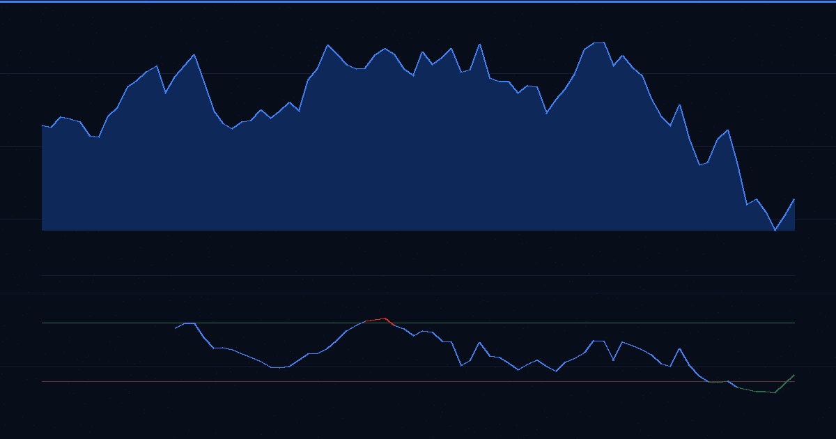
Volume: The Confirmation Tool
Volume shows how many shares traded during a period.
It's displayed as bars at the bottom of most charts.
Why Volume Matters
Volume confirms price moves:
High volume + price move = conviction
- Lots of traders agree on the direction
- Move is more likely to continue
Low volume + price move = suspicion
- Few traders participating
- Move may not be sustainable
Volume Rules
1. Volume confirms breakouts
- Price breaks resistance on high volume → real breakout
- Price breaks resistance on low volume → possible false breakout
2. Volume confirms trends
- Uptrend with increasing volume → healthy trend
- Uptrend with decreasing volume → trend may be weakening
3. Volume spikes signal interest
- Unusual volume = something is happening
- Often precedes big moves
- Worth investigating why
Reading Volume Bars
Most charts color volume bars:
- Green volume bar: Price closed up that day
- Red volume bar: Price closed down that day
Look for:
- Volume spikes (much higher than average)
- Volume trends (increasing or decreasing over time)
- Volume at key levels (support/resistance breaks)
Moving Averages
A moving average smooths out price data to show the underlying trend.
Types of Moving Averages
Simple Moving Average (SMA):
- Average of closing prices over X periods
- Example: 50 SMA = average of last 50 closing prices
Exponential Moving Average (EMA):
- Weighted average giving more importance to recent prices
- Reacts faster to price changes than SMA
Common Moving Averages
| MA | Timeframe | What It Shows |
|---|---|---|
| 10 or 20 MA | Short-term | Recent trend |
| 50 MA | Medium-term | Intermediate trend |
| 200 MA | Long-term | Major trend |
How to Use Moving Averages
1. Trend identification:
- Price above MA = bullish
- Price below MA = bearish
- 50 MA above 200 MA = bullish long-term
- 50 MA below 200 MA = bearish long-term
2. Dynamic support/resistance:
- MAs often act as support in uptrends
- MAs often act as resistance in downtrends
3. Crossovers:
- Golden Cross: 50 MA crosses above 200 MA (bullish)
- Death Cross: 50 MA crosses below 200 MA (bearish)
Moving Average Alerts
Set alerts when price approaches key moving averages:
- "Alert me when AAPL touches its 200-day MA"
- "Alert me when NVDA's 50 MA crosses above 200 MA"
Putting It All Together: Reading a Chart
Here's a step-by-step process for analyzing any chart:
Step 1: Identify the Trend
Look at the overall direction:
- Higher highs and higher lows? → Uptrend
- Lower highs and lower lows? → Downtrend
- Going sideways? → Range
Ask: "Which direction is the path of least resistance?"
Step 2: Find Key Levels
Identify support and resistance:
- Where has price bounced before?
- Where has price been rejected before?
- Any round numbers or obvious levels?
Ask: "Where are the important decision points?"
Step 3: Check Where Price Is Now
Location matters:
- At support in an uptrend? → Potential buy zone
- At resistance in a downtrend? → Potential sell zone
- Middle of nowhere? → Wait for better setup
Ask: "Is price at a significant level?"
Step 4: Look at Recent Candles
Read the most recent price action:
- Any reversal patterns?
- Strong candles or weak candles?
- Increasing or decreasing momentum?
Ask: "What are buyers and sellers doing right now?"
Step 5: Confirm with Volume
Check if volume supports your analysis:
- High volume at key levels = conviction
- Low volume = wait for confirmation
Ask: "Do other traders agree with this move?"
Step 6: Consider Multiple Timeframes
Zoom out for context:
- Does the higher timeframe support your thesis?
- Are you trading with or against the bigger trend?
Ask: "What's the bigger picture?"
Common Chart Reading Mistakes
Mistake 1: Over-Complicating
Problem: Adding 10 indicators until the chart is unreadable.
Fix: Start with price, support/resistance, and volume. Add indicators only when you understand why you need them.
Mistake 2: Ignoring Timeframe Context
Problem: Buying on a 5-minute chart bullish signal while the daily chart is in a downtrend.
Fix: Always check the higher timeframe. Trade with the bigger trend, not against it.
Mistake 3: Seeing Patterns Everywhere
Problem: Finding "head and shoulders" in random noise.
Fix: Patterns need context. A hammer at support after a downtrend means something. A hammer in the middle of nowhere means little.
Mistake 4: Expecting Perfection
Problem: Waiting for price to hit support "exactly" or patterns to be "textbook."
Fix: Support and resistance are zones, not lines. Patterns are approximations, not templates. Leave room for imperfection.
Mistake 5: Forgetting Volume
Problem: Acting on price moves without checking volume.
Fix: Volume confirms or denies. A breakout on low volume is suspicious. A reversal on high volume is meaningful.
Setting Chart-Based Alerts
Once you can read charts, set alerts to notify you when key levels are reached.
Price alerts:
- "Alert me when AAPL drops to $180" (support level)
- "Alert me when NVDA breaks above $500" (resistance level)
Moving average alerts:
- "Alert me when TSLA touches its 200-day MA"
- "Alert me when SPY crosses below its 50-day MA"
Percentage move alerts:
- "Alert me when GOOGL moves 5% in a day"
- "Alert me when AMD drops 10% from recent high"
This way, you don't have to watch charts all day. Set alerts at key levels and let the market come to you.
Tools for Chart Analysis
Free Charting Platforms
TradingView (Free tier):
- Best free charting
- Clean interface
- Tons of indicators
- Works in browser
Yahoo Finance:
- Basic but functional
- Good for quick looks
- Free, no account needed
Finviz:
- Great for scanning + quick charts
- Pattern recognition features
- Free tier is solid
What to Look for in a Charting Platform
- Multiple timeframes
- Drawing tools (trendlines, support/resistance)
- Common indicators (moving averages, volume)
- Clean, readable display
- Save your analysis
Frequently Asked Questions
How do you read a stock chart for beginners?
Start with three basics: (1) Price direction - is the stock trending up, down, or sideways? (2) Support and resistance - where does price repeatedly bounce or get rejected? (3) Volume - are moves happening on high or low trading activity? Master these before adding indicators. Use candlestick charts for the most information in a single view.
What do the colors on a stock chart mean?
Green (or white/hollow) candles mean the stock closed higher than it opened - a bullish day. Red (or black/filled) candles mean the stock closed lower than it opened - a bearish day. The color shows who won that time period: buyers (green) or sellers (red). Color schemes vary by platform but the concept is the same.
What is a candlestick chart?
A candlestick chart shows four prices for each time period: open, high, low, and close (OHLC). The "body" shows open-to-close range, while "wicks" or "shadows" show the high and low. Green candles closed higher than they opened; red candles closed lower. Candlesticks reveal price action and market psychology better than line charts.
What is support and resistance in stock charts?
Support is a price level where buying interest is strong enough to stop declines - the stock "bounces" off this floor. Resistance is a price level where selling pressure stops advances - the stock hits this "ceiling" and retreats. These levels form from historical price memory and become key decision points for traders.
What chart timeframe should beginners use?
Beginners should start with daily charts for a clear view of price trends without intraday noise. Once comfortable, add weekly charts for bigger-picture context. Only move to intraday charts (1-hour, 15-minute) if you're actively day trading. Most investors do fine with just daily and weekly charts.
How do you identify trends on a stock chart?
An uptrend shows higher highs and higher lows - each peak and trough is above the previous. A downtrend shows lower highs and lower lows - each peak and trough is below the previous. A sideways trend (range) shows roughly equal highs and lows. Draw trendlines connecting the lows (uptrend) or highs (downtrend) to visualize.
The Bottom Line
Reading stock charts is a skill, not a talent.
It takes practice. The more charts you look at, the faster patterns become recognizable.
Start simple:
- Learn to see the trend
- Identify support and resistance
- Read candlesticks
- Confirm with volume
That's 80% of chart reading right there.
Don't rush to add indicators. Don't memorize 50 candlestick patterns. Master the basics first. The advanced stuff will make more sense once the foundation is solid.
Charts tell a story. Every candle is a battle between buyers and sellers. Every support bounce is hope. Every resistance rejection is doubt.
Learn to read the story, and you'll see what others miss.
Related Articles
- Technical vs. Fundamental Analysis: Which Approach Is Right for You?
- Stock Market Sentiment: How to Read the Mood of the Market
- 7 Essential Trading Tools Every Active Trader Needs in 2026
- Relative Strength: The Complete Guide
Get alerted at key chart levels
Don't watch charts all day. Set alerts at support, resistance, and breakout levels. StockAlarm notifies you the moment price reaches your targets.
S&P 500 Screener
Filter by metrics, fundamentals
Price Alerts
Never miss a move
35+ Global Markets
Stocks, crypto, futures
AI Analysis
Powered by Claude