Stock Charts — Price, Candlestick & Fundamental
Interactive stock charts for any publicly traded company. Price history up to 20 years, candlestick and OHLC charts, moving averages, volume, and 120+ fundamental metrics — all in one free chart builder.
What Are Stock Charts?
A stock chart is a graphical representation of a stock's price or financial data over time. The most common type — the price chart — plots the stock's closing price (or open, high, low, and close in a candlestick chart) across a selected timeframe. A fundamental chart plots the underlying business metrics: revenue, earnings, cash flow, margins, and valuation ratios.
Stock charts are the primary tool for both technical analysis (pattern recognition, momentum, trend following) and fundamental analysis (business quality, growth trajectory, historical valuation). Used together, they provide a complete view of a stock — the price trend in the market and the business performance driving that trend.
Stock Alarm Pro's chart builder lets you switch between price and fundamental data for any stock, add technical overlays like moving averages and RSI, compare multiple stocks on one chart, and view up to 20 years of history — all from your browser.
6 Types of Stock Charts
Different chart types reveal different aspects of price action and business performance.
Line Chart
Connects closing prices over time. The simplest view — ideal for spotting long-term trends without the noise of intraday price swings.
Best for: Long-term trend analysis, fundamental data, multi-stock comparisons
Candlestick Chart
Shows open, high, low, and close (OHLC) for each period. Green candles = price closed up. Red candles = price closed down. The most information-dense chart type.
Best for: Technical analysis, identifying reversals, reading market sentiment
Area Chart
A line chart with the area below filled in. Makes trend direction visually obvious. Commonly used for market index charts.
Best for: Presenting portfolio value, index performance, revenue trends
Bar (OHLC) Chart
Vertical bars with tick marks showing open and close prices. Similar information to candlestick but more compact. Less common but still widely used by professionals.
Best for: Technical analysis when you want a cleaner look than candlesticks
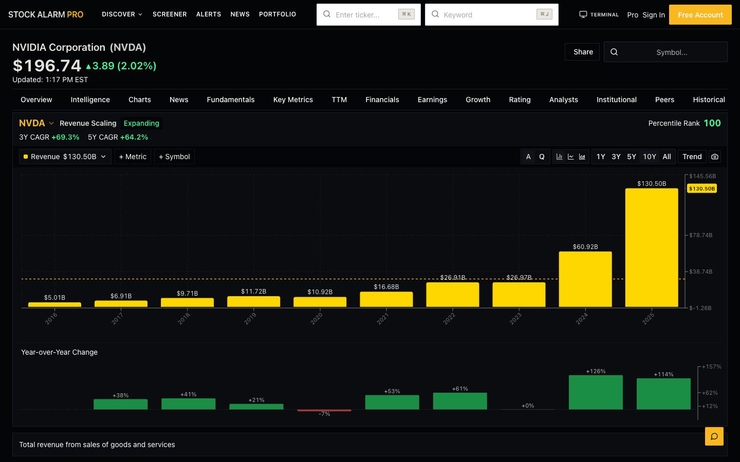
Fundamental Chart
Plots financial statement data: revenue, earnings, cash flow, margins, valuation multiples. Annual or quarterly. The opposite of a price chart — shows the business, not the stock.
Best for: Value investing, growth analysis, peer comparison, business quality assessment
Indexed Comparison
Sets multiple stocks to 100 at a start date and plots percentage returns. Removes share price bias so you can compare AAPL ($180) vs. NVDA ($900) on equal footing.
Best for: Comparing two or more stocks over any time period on one chart
How to Read a Stock Chart
Six steps from opening a chart to making an informed investment decision.
- 1
Identify the trend direction
Look at the overall direction of price from left to right. Is the stock making higher highs and higher lows (uptrend)? Lower highs and lower lows (downtrend)? Or moving sideways in a range? The trend is your first and most important read.
- 2
Check the 50-day and 200-day moving averages
Add both moving averages as overlays. Price consistently above both MAs is bullish. Price below the 200-day MA is a long-term warning sign. A "Golden Cross" (50-day crossing above 200-day) is widely watched as a bullish signal.
- 3
Find support and resistance levels
Look for price levels the stock has repeatedly bounced off (support) or reversed from (resistance). These are the market's memory — they often predict future behavior because many traders are watching the same levels.
- 4
Read the volume bars
Volume confirms price moves. A breakout from a resistance level on 2× average volume is far more significant than one on thin volume. A price rally on declining volume often signals the move is running out of buyers.
- 5
Zoom out to put the move in context
Whatever timeframe you're trading, zoom out one level. A stock that looks like a great uptrend on a 3-month chart might be a small bounce inside a 2-year downtrend on the weekly chart. Always know where you are in the bigger picture.
- 6
Cross-reference with a fundamental chart
Is the price trend backed by business reality? A stock up 40% is exciting — but if revenue is declining and margins are compressing, the price trend is on shaky ground. Switch to the fundamental chart view to confirm the thesis.
Key Stock Chart Overlays & Indicators
The four most important overlays for any stock chart — what they mean and why they matter.
50-Day Moving Average (SMA50)
What it is: Average closing price over 50 trading days.
Why it matters: Acts as a dynamic support/resistance level in intermediate-term trends. Stocks holding above their 50-day MA in a healthy uptrend often use it as a launchpad during pullbacks.
200-Day Moving Average (SMA200)
What it is: Average closing price over 200 trading days (~10 months).
Why it matters: The single most-watched indicator among institutional investors. Trading above = long-term uptrend. Trading below = long-term downtrend. A "Golden Cross" (50-day crossing above 200-day) is a bullish signal; a "Death Cross" is bearish.
Volume Bars
What it is: Number of shares traded each period, shown as bars at the bottom of the chart.
Why it matters: Volume confirms price moves. A breakout from a resistance level on 2× average volume is far more reliable than one on thin volume. Declining volume in an uptrend can signal exhaustion.
Relative Strength Index (RSI)
What it is: Momentum oscillator (0–100). Above 70 = overbought. Below 30 = oversold.
Why it matters: Helps identify extreme price conditions. Stocks in strong uptrends can stay "overbought" for extended periods. Best used to spot divergences — price making new highs while RSI falls.
Stock Chart Timeframes — Which to Use
The right chart timeframe depends on your investment style and time horizon.
| Timeframe | Bar Interval | Used By | Best For |
|---|---|---|---|
| 1 Day | Minute/5-minute bars | Day traders | Intraday price action, ideal for entries on gap-ups or intraday breakouts |
| 3 Months | Daily bars | Swing traders | Short-term chart patterns, earnings reactions, sector rotation moves |
| 1 Year | Daily bars | Active investors | Annual trend, key support/resistance levels, post-earnings bases |
| 3 Years | Weekly bars | Growth investors | Multi-year trend, market cycle behavior, revenue growth vs. price growth |
| 5 Years | Weekly bars | Long-term investors | Full business cycle view, fundamental trend confirmation, valuation history |
| 10 Years | Monthly bars | Value investors | Decade-scale business performance, recession resilience, long-term compounder identification |
Price Charts vs. Fundamental Charts
| Dimension | Price Charts | Fundamental Charts |
|---|---|---|
| What they show | Stock price, volume, momentum patterns | Revenue, earnings, margins, cash flow, valuation ratios |
| Time horizon | Intraday to years | Quarterly to decades |
| Update frequency | Real-time to daily | Quarterly (earnings reports) |
| Main question | Where is the stock price going? | How is the underlying business performing? |
| Used by | Technical traders, all investor types | Value and growth investors, fundamental analysts |
| Key metrics | Moving averages, RSI, MACD, Bollinger Bands | Revenue, EPS, P/E, gross margin, FCF, ROE |
Most successful investors use both. A price chart shows you when to act; a fundamental chart tells you what you're investing in. Explore fundamental charts →
Build Any Stock Chart in Seconds
The Stock Alarm Pro Chart Builder lets you plot any stock's price or fundamental data over any timeframe. Compare multiple stocks on one chart, add technical overlays, and share charts with a permanent link.
- Price, candlestick, area, and bar charts
- 20+ years of price history
- Moving averages: 50-day, 200-day
- 120+ fundamental metrics
- Multi-stock indexed comparison
- Shareable chart links
Set Alerts on Stock Chart Signals — Get Notified in Real Time
Reading a chart is only half the job. Stock Alarm Pro lets you set alerts on the exact chart signals you're watching — so you never miss a move while you're away from the screen.
Moving average cross alerts
Get notified when a stock crosses above or below its 50-day or 200-day moving average — the Golden Cross and Death Cross signals in real time.
Price level alerts
Set an alert at any price level — support, resistance, breakout points, or your target entry price. Get a push notification the moment the stock touches it.
RSI overbought/oversold alerts
Trigger an alert when RSI crosses above 70 (overbought) or below 30 (oversold) — catch momentum extremes before they reverse.
Volume spike alerts
Be alerted when a stock trades 2× or 3× its average daily volume — often the first sign of institutional buying or a news-driven move.
Stock Charts by Company
Jump directly to a stock's chart with full technical and fundamental data.
The Multi-Timeframe Rule
Professional traders never act on a single timeframe. They read charts from the top down: weekly chart to establish the macro trend, daily chart to find the setup, hourly chart to time the entry. If all three timeframes agree on direction, the trade is higher probability.
For long-term investors, the equivalent is the monthly-weekly-daily progression. A stock making new all-time highs on the monthly chart, holding above its 50-week moving average on the weekly, and pulling back to the 50-day on the daily is a classic institutional accumulation pattern — one of the highest-probability setups in the market.
Frequently Asked Questions
What types of stock charts are available?
Stock Alarm Pro supports two main categories of stock charts: (1) Price charts — line, candlestick, bar (OHLC), and area charts that plot a stock's price and volume history with overlays like moving averages and Bollinger Bands. (2) Fundamental charts — bar and line charts that plot financial statement data like revenue, earnings per share, P/E ratio, free cash flow, gross margin, and 120+ other financial metrics. Both can be compared across multiple stocks on one chart.
How far back does stock chart history go?
Price chart history goes back up to 20+ years for major US-listed stocks. Fundamental chart history goes back up to 10 years of annual data and 5 years of quarterly data. Historical data is available for all S&P 500 stocks and most major US-listed companies.
What is a candlestick stock chart?
A candlestick chart displays four prices for each time period: the open, high, low, and close (OHLC). Each candlestick has a body (the area between open and close) and wicks (lines extending to the high and low). A green/white candle means the price closed higher than it opened (bullish). A red/black candle means it closed lower (bearish). Candlestick charts are the most popular chart type among technical traders because they pack more information into each bar than a simple line chart.
What does a 200-day moving average on a stock chart mean?
The 200-day simple moving average (SMA) is the average closing price of a stock over the past 200 trading days. It is widely used as a dividing line between long-term uptrends and downtrends. When a stock is trading above its 200-day moving average, it is generally considered to be in a long-term uptrend. When it drops below, many investors interpret that as a warning sign. Many institutions use the 200-day SMA as a core portfolio filter.
How do I compare two stocks on the same chart?
In the Stock Alarm Pro Chart Builder, click 'Add Series' and enter a second ticker. You can overlay any two or more stocks on one chart. For price comparison, use the 'Indexed' view which sets both stocks to 100 at the start date — this shows percentage return comparison rather than raw price, making it an apples-to-apples comparison regardless of share price level. The same feature works for fundamental metrics: compare AAPL revenue vs MSFT revenue on one chart.
What is the best stock chart timeframe for analysis?
The best timeframe depends on your investment horizon: Day traders use 1-minute to 1-hour charts. Swing traders use daily charts with a 3-month to 1-year view. Long-term investors use weekly and monthly charts with 3-10 year views. For fundamental charts, use a minimum 5-year view to capture a full business cycle — this smooths out year-to-year noise and reveals the real underlying trend in revenue, earnings, and margins.
Are stock charts free to use?
Yes. The Stock Alarm Pro Chart Builder is free to use for price charts and fundamental charts. Free accounts can build and share charts for any US-listed stock. A Gold subscription unlocks real-time price data, advanced technical overlays, and unlimited chart saves.